L'École du Petit Ballon
Wine learning platform
Client Le Petit Ballon
Year 2023
My Role UI Design · Visual Identity · UX Research
Team Olivier Kraff, Brand Director · Yannick Lamour, CTO · Sergio Diez, Front-end Developer · Laura Vendramini, UX & PM · The Makers Co., Illustration
→ Read full case study
Challenge
75% of self-subscribers felt they knew little or nothing about wine — some after ten years of receiving the box. The brand's promise, apprendre du vin sans baratin, wasn't being delivered
Role
Proposed and won the UI direction over an external agency, based on two years building the brand's visual identity from inside.
Led UI design and visual identity for the full platform — landing, levels, lessons, and two distinct quiz experiences.
Designed and conducted usability testing in Paris alongside the UX lead.
Managed monthly lesson content updates post-launch.
Approach
Mobile-first, informed by a user interview: someone mentioned reading lessons on the metro on their way to work.
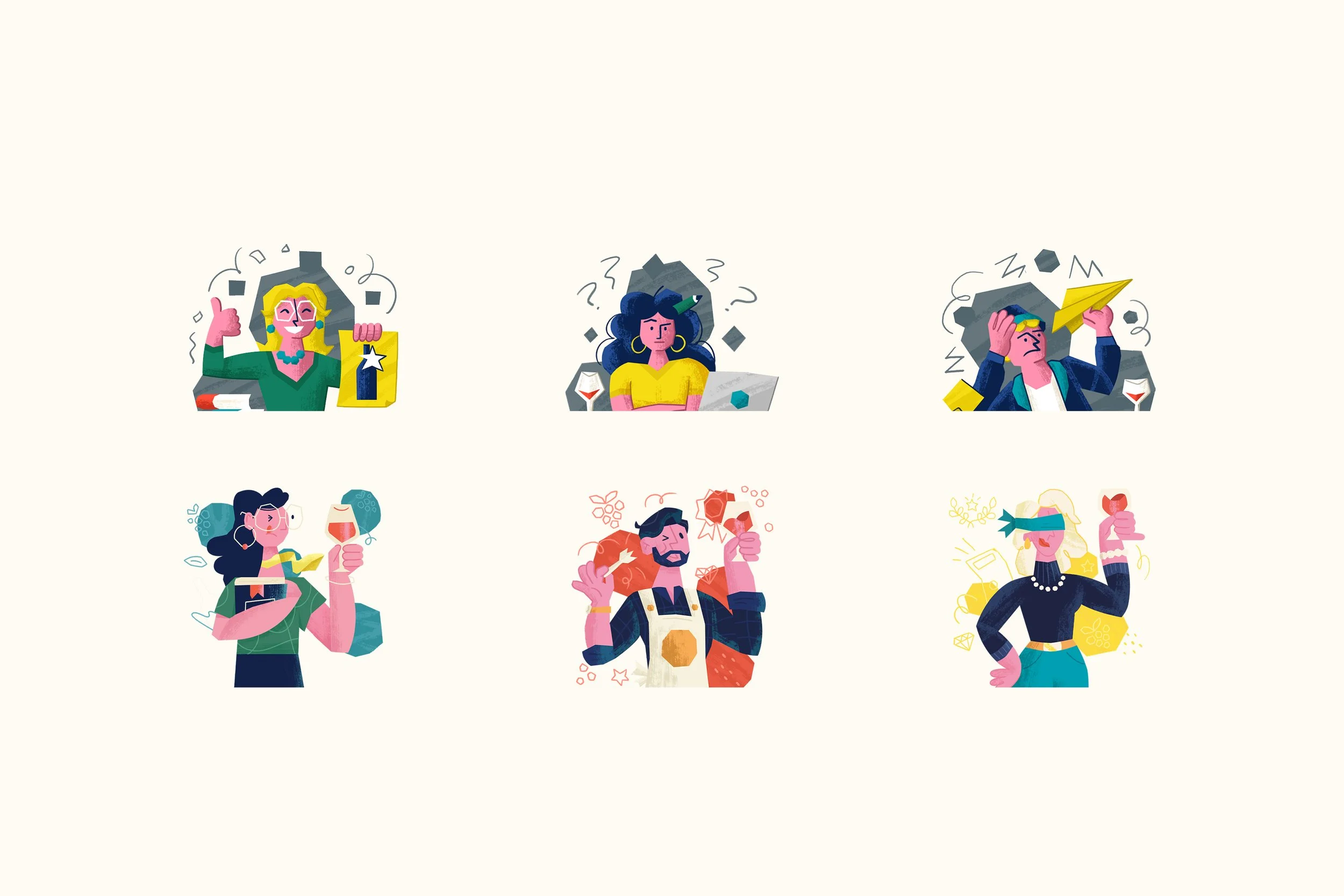
Three-level structure (Apprentis · Fins connaisseurs · Experts) with distinct color registers — legible at a glance, not just decorative.
Two visual modes for testing: light for lesson quizzes, dark for chapter exams. Users feel the shift in stakes before reading a word.
Impact
avg. time on lesson pages vs 35s site-wide
194s
unique views · first 3 months
5,304
conversion on connected landing
6.33%
The school was discontinued during the website’s migration. Retention, the primary goal, was never fully measured. What we did see: lesson pages held users for 194 seconds on average, against a 35-second site average. In hindsight, an MVP approach would have let us validate that engagement before the full build.
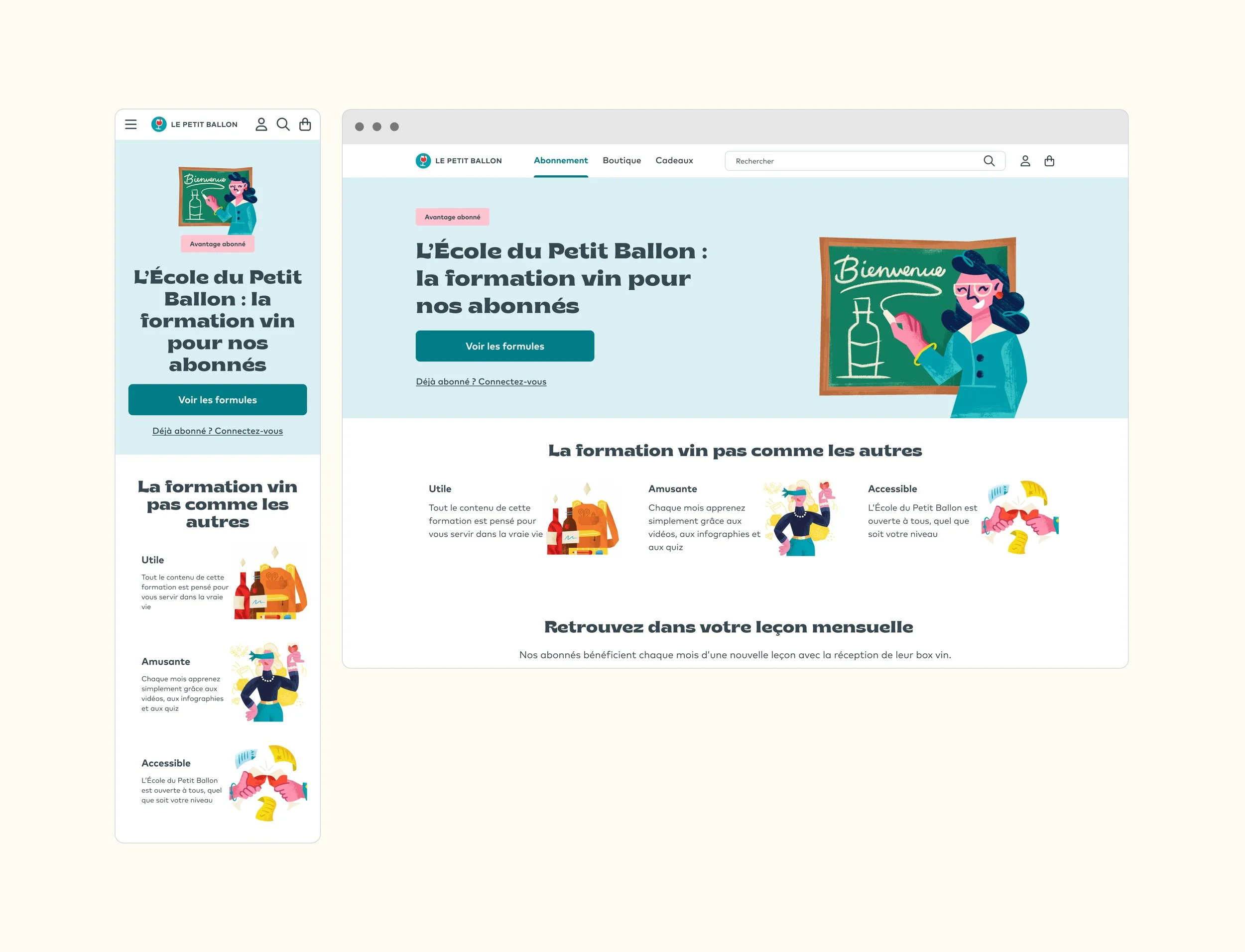
Entry point for non-subscribers — positions the school as a reason to subscribe. Designed for both desktop and mobile.
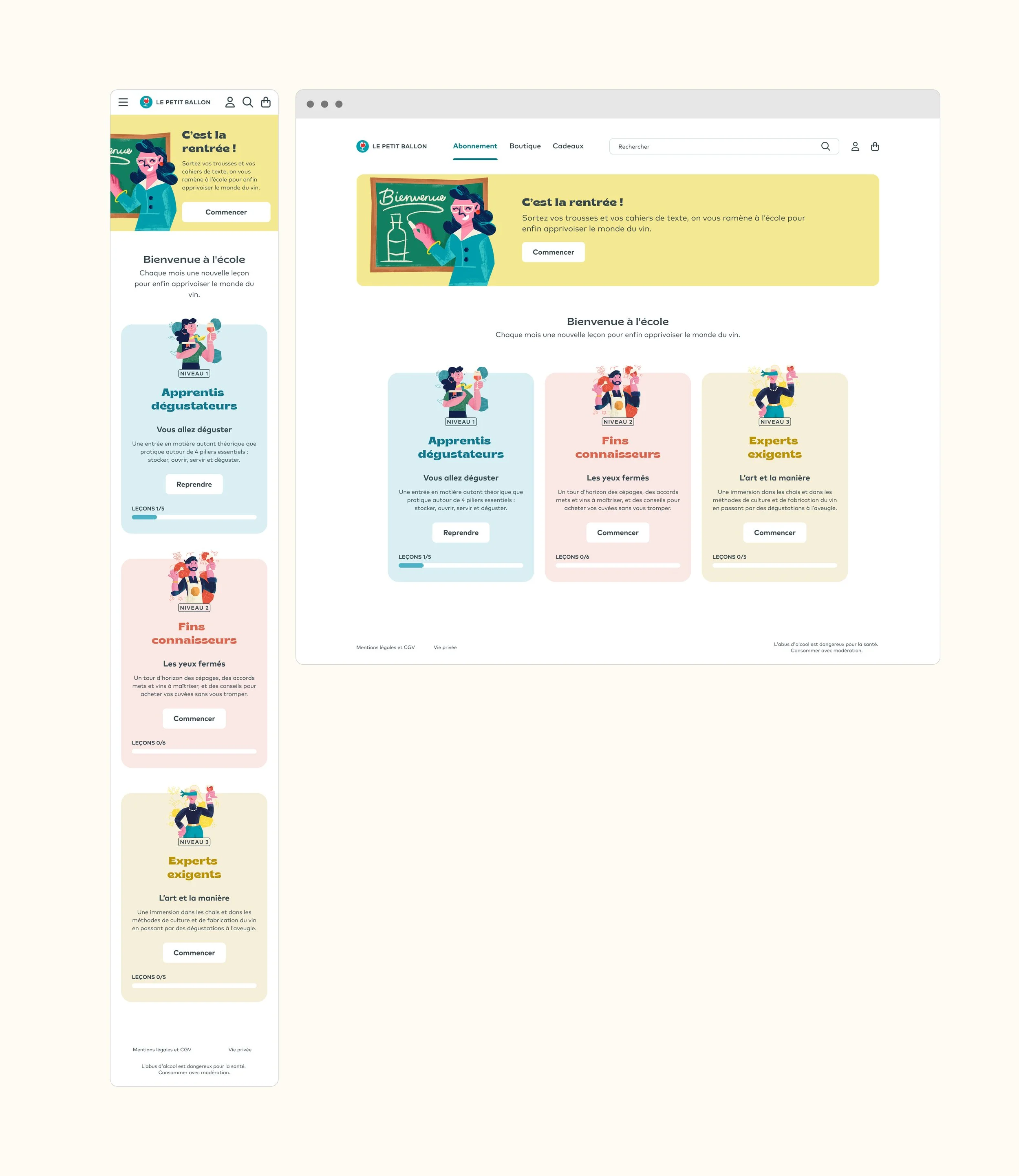
Three levels, each with its own color register and illustrated character. Progress tracked per level. Color system designed to orient users at a glance — not decorative.
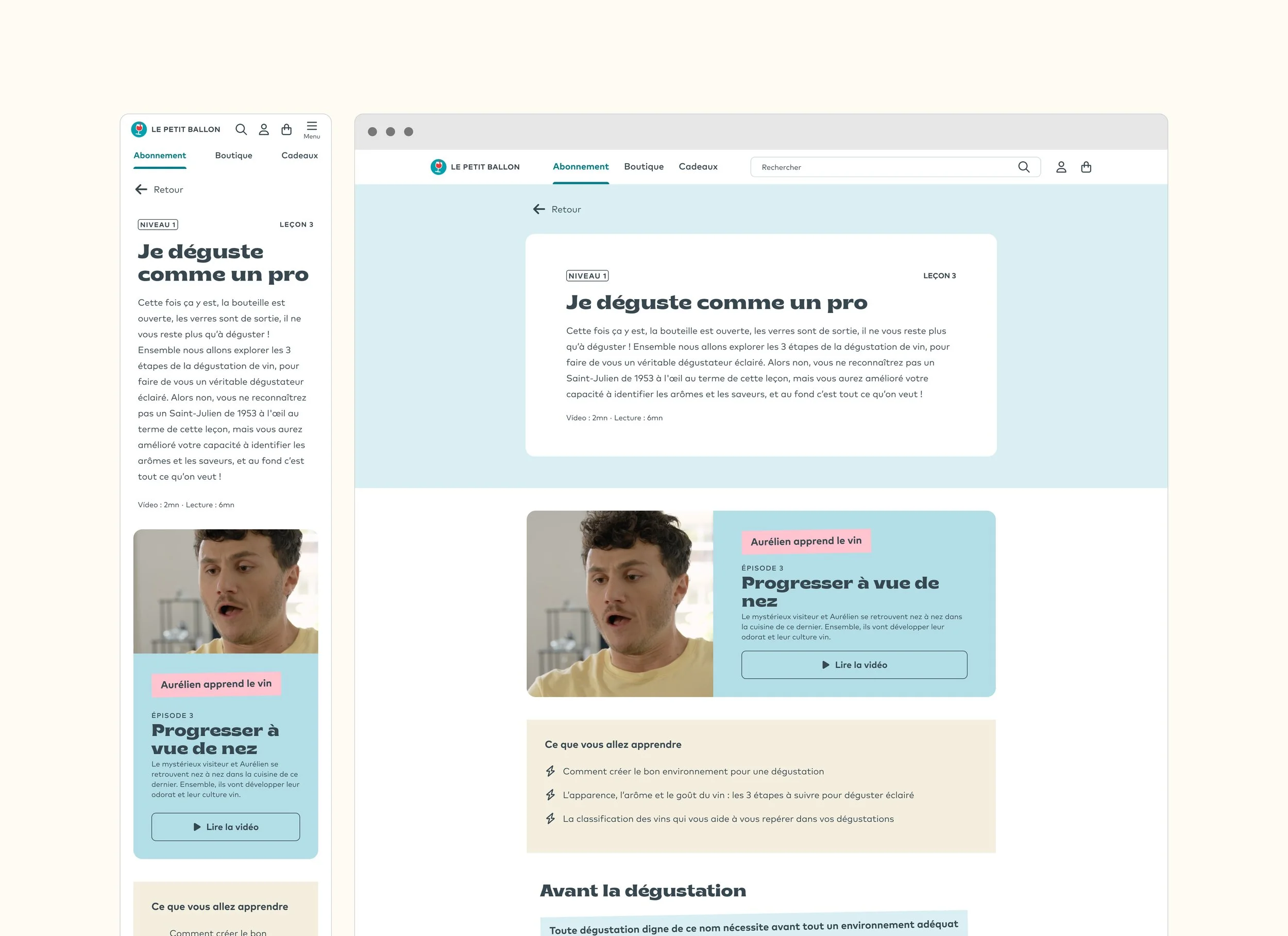
Lesson list within a level. Mobile-first layout built around how users actually navigate — in short sessions, on the go.
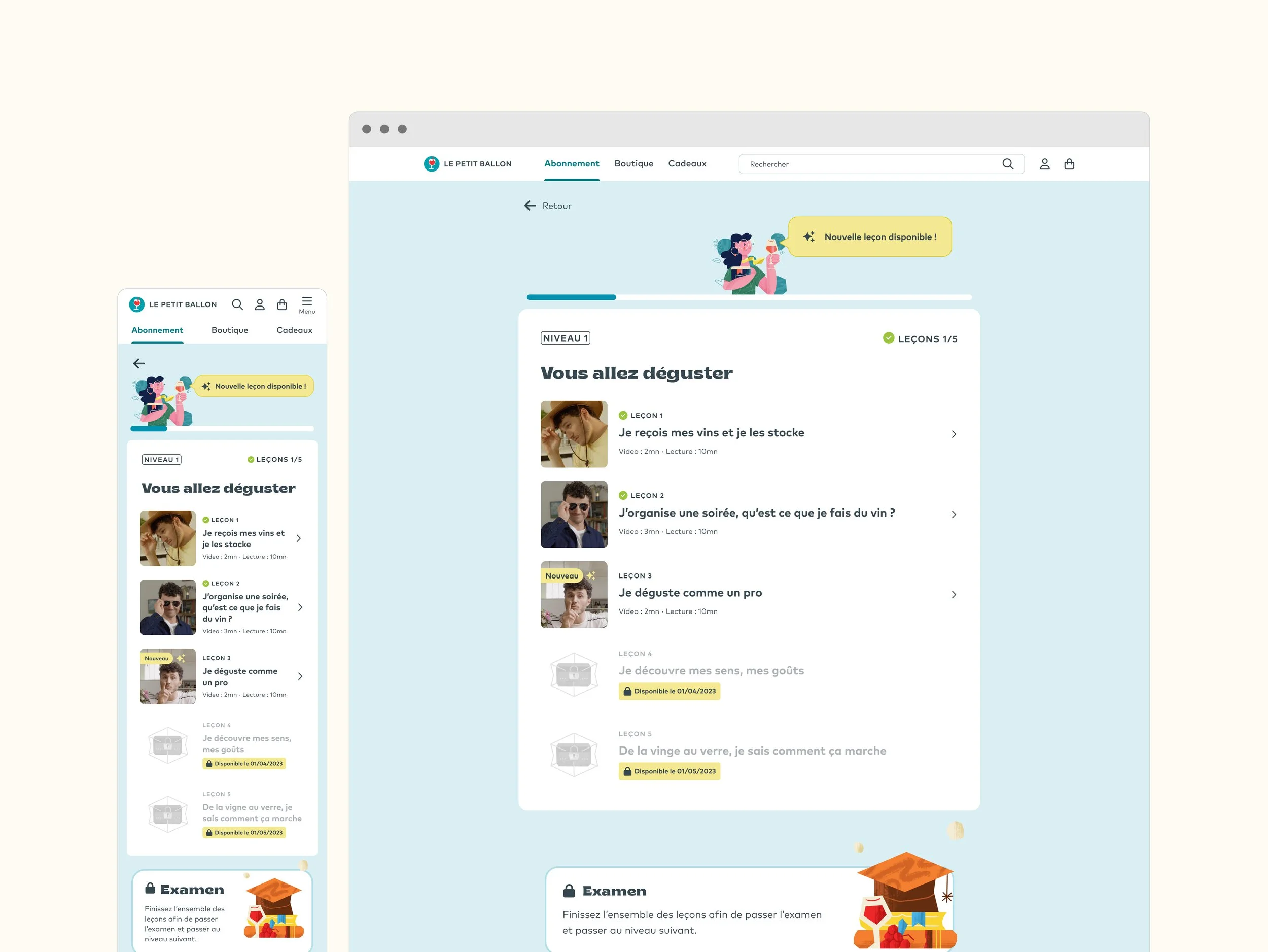
Rich editorial layout combining video, infographics, and structured content. Lesson pages averaged 194s — more than 5× the site average.
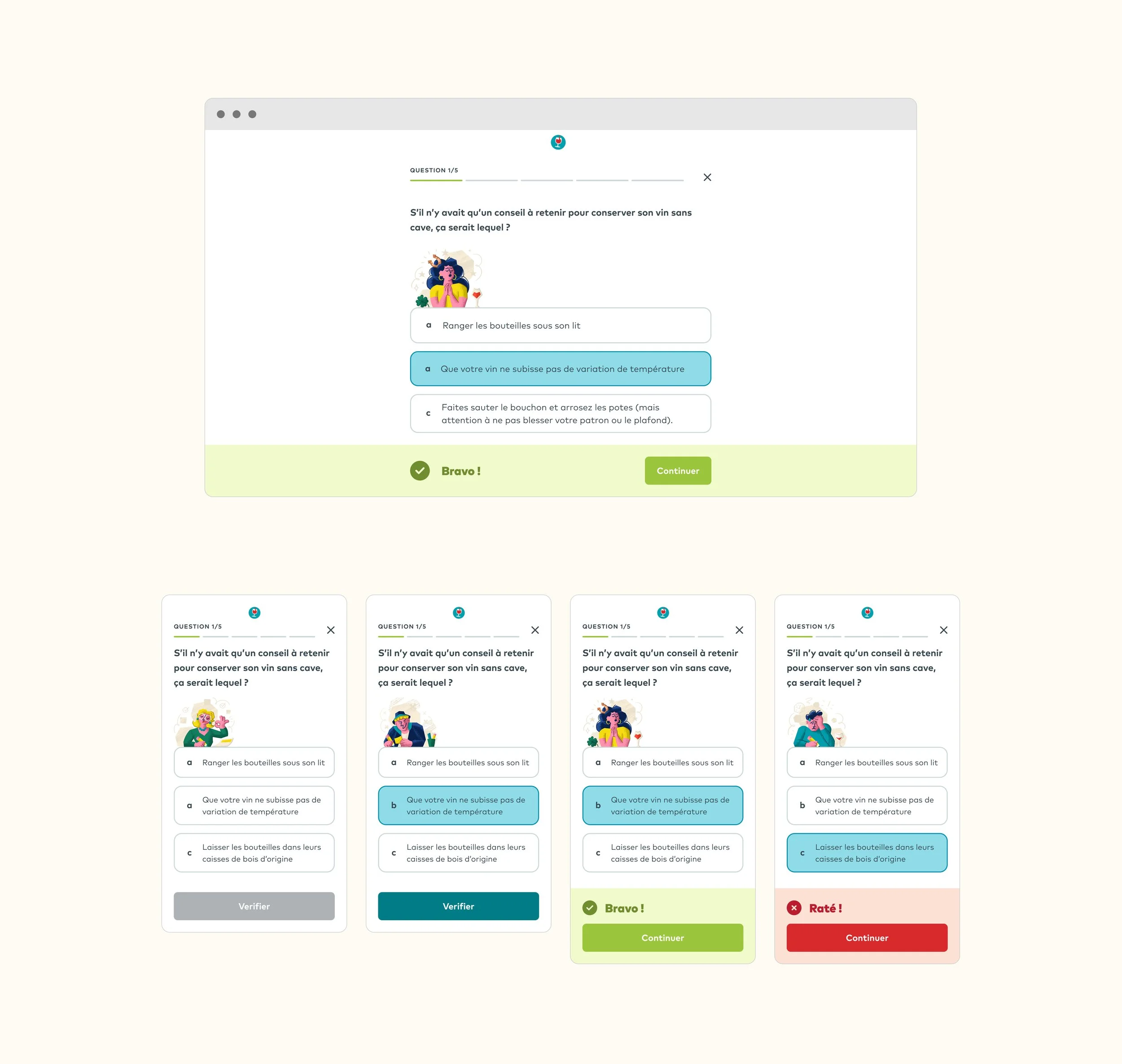
Light palette — quick knowledge check after each lesson. Four interaction states: empty, selected, correct, incorrect.
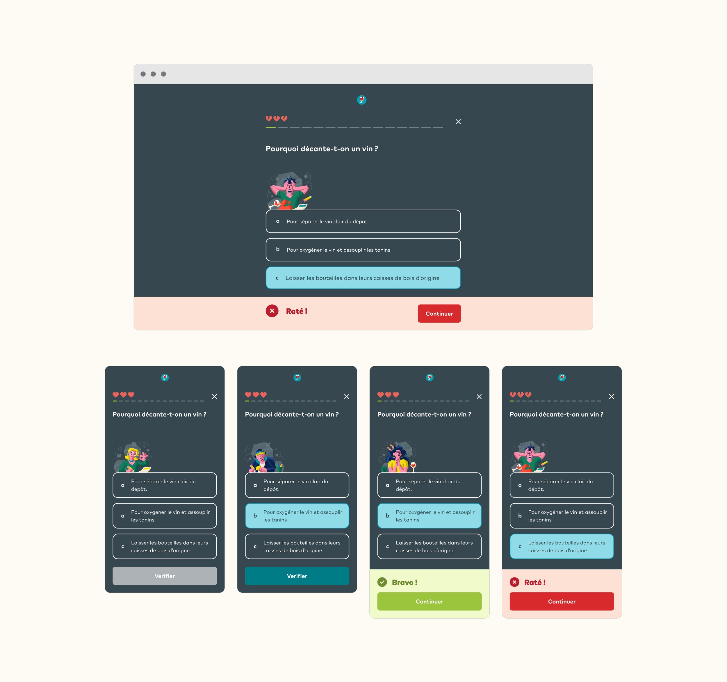
Dark background — deliberate mode shift that signals higher stakes. Users feel the difference before reading a question. Lives system adds consequence.
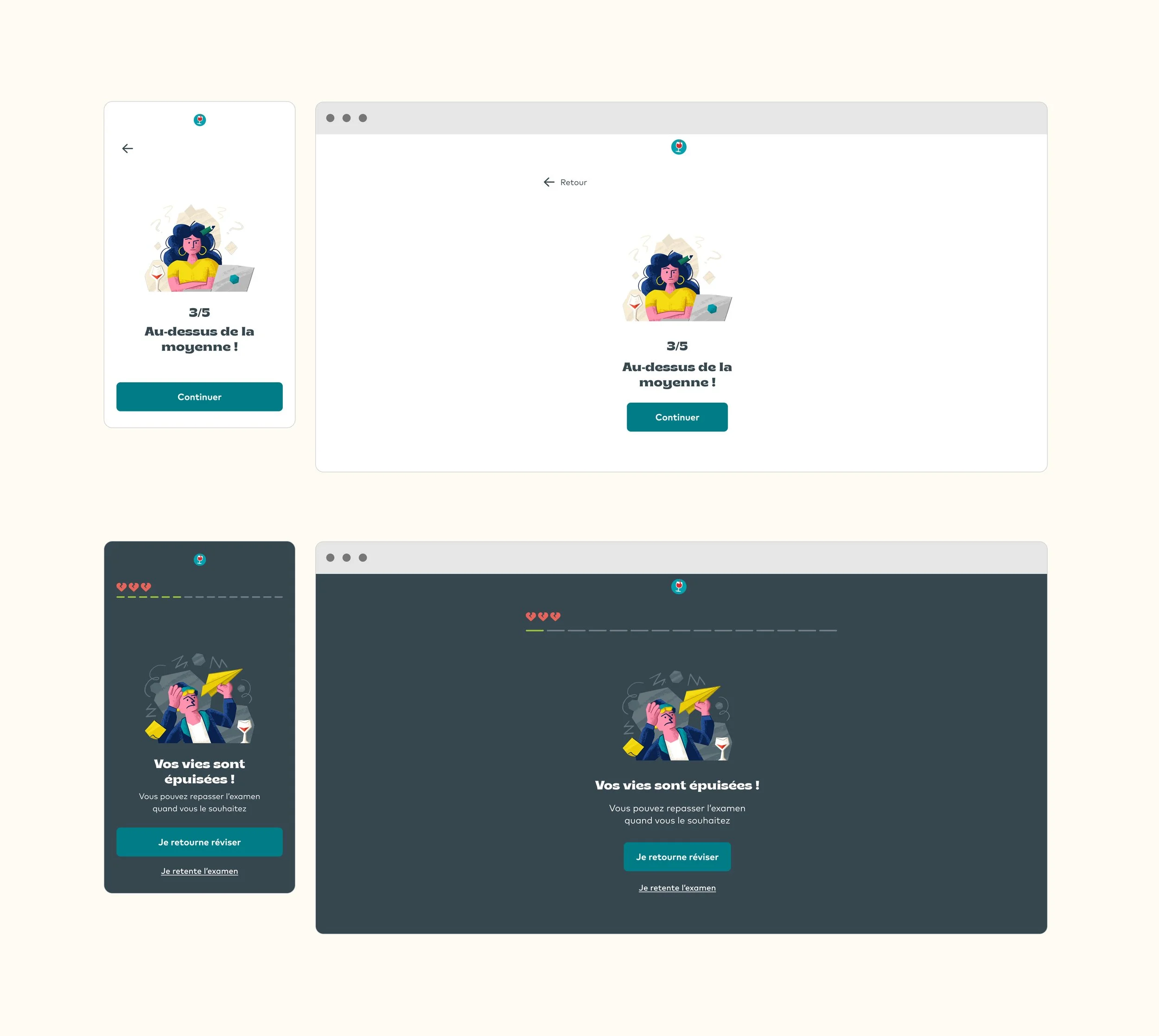
End states matched to the brand's voice. "Au-dessus de la moyenne !" for a pass, "Vos vies sont épuisées" for a fail — personality lives in the interaction states, not just the visuals.