Le Petit System 2.0
Design system & rebranding
Client Le Petit Ballon
Year 2024
Disciplines Design Systems · Brand · UI
Team Team Olivier Kraff, Brand Director · Yannick Lamour, CTO · Sergio Diez, Front-end Developer · Laura Vendramini, UX & PM
My role Design System Lead · UI Design · Brand Integration
→ Read full case study
Challenge
Two business pivots in two years left the brand fragmented and the system hard to design with. The colour palette had grown to 350 styles. Typography wasn't meeting visual or functional needs, leading to low adoption. Eight months to rebuild both from the ground up — alongside a platform migration from Magento to Shopify.
Approach
Rebuilt foundations first — type system tested across responsive scales in Figma before anything was finalised, applied across layouts to evaluate legibility and hierarchy.
Built the colour palette to match the new brand tone, broader in range for flexibility and accessibility above all. Every combination tested against WCAG 2.1 with Stark.
Rolled out components gradually — prioritised by need, in parallel with the ongoing website redesign. Not everything at once.
Introduced a weekly "Designers only" ritual from day one — a space to share explorations, raise questions, and build shared ownership of the new foundations.
Set a naming convention for every component and pattern (Family-Variant, or Family-Type-Modifier) and documented each one in Figma. Before leaving the company, I encoded the rules into a ChatGPT prompt so the team could keep classifying new additions in the same logic.
Impact
colour styles reduced to primitives
350 → 46
text style adjusted after a full year of implementation
1
developer complaints about detached text styles
0
The system was adopted across product, CRM, and marketing. Non-design teams gained independence in building visual assets. The core system remains stable while the brand continues to evolve.
"It doesn't have to be perfect — what truly matters is adoption."
Tested across responsive scales in Figma. After a year of implementation, only one pricing style needed adjustment.
350 styles reduced to 46 primitives. Restructured into primitive and semantic layers — bolder, more scalable, WCAG 2.1 verified.
Components named under one convention (Family-Variant, or Family-Type-Modifier), and grouped into indexed categories so the system stayed legible as it grew.
Patterns followed the same convention (hero patterns, recipe layouts, gift flows), so the naming logic held as compositions grew larger.
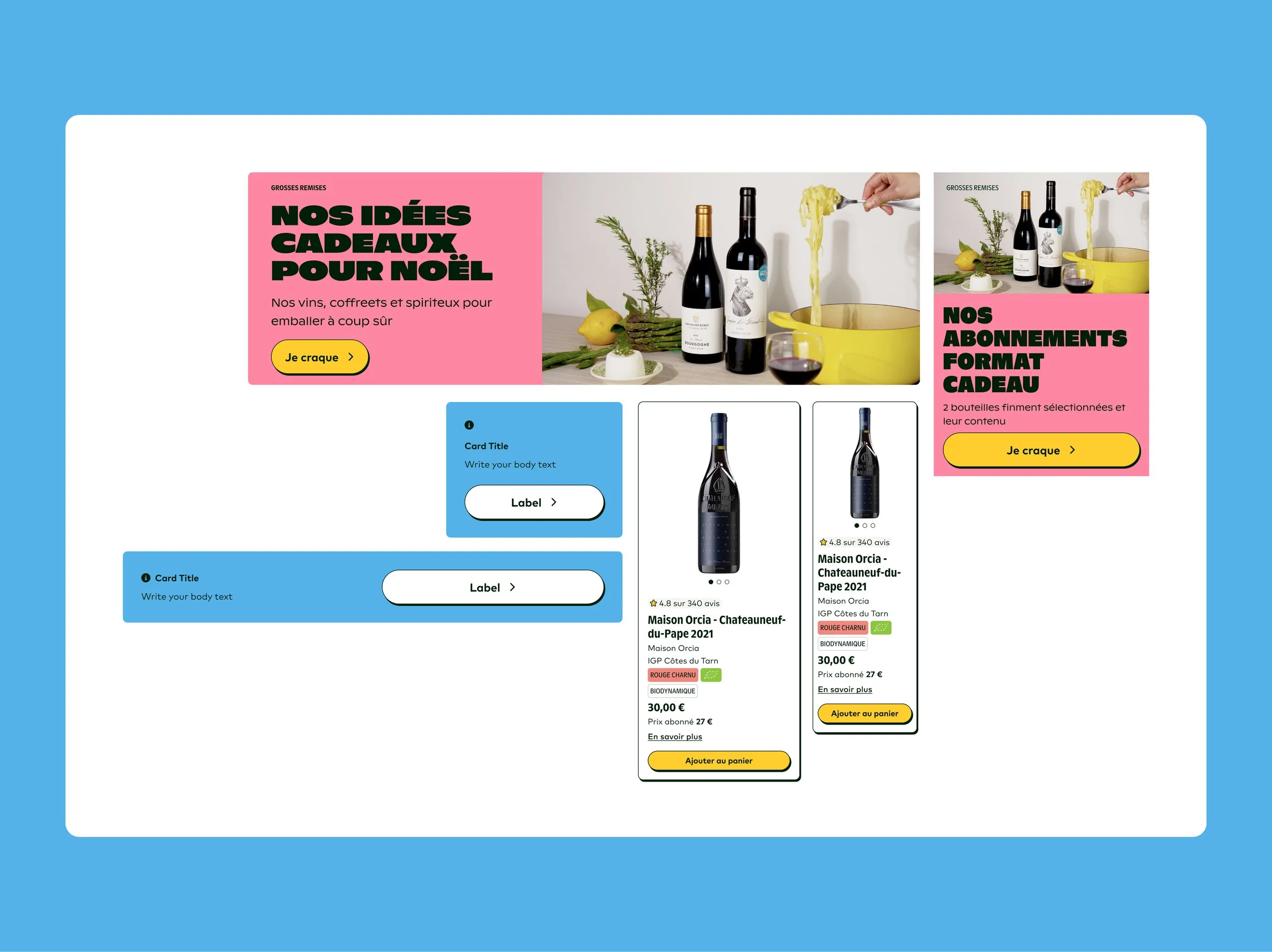
Rolled out gradually, prioritised by need alongside the website redesign.
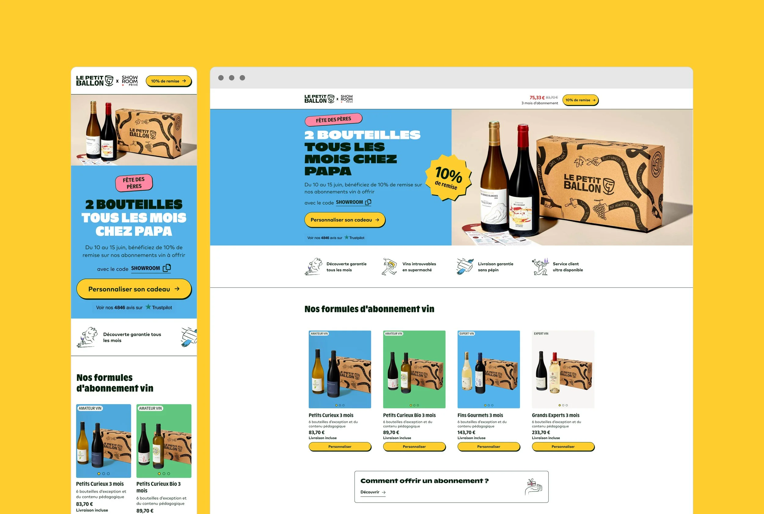
The system in production. Delivered on time alongside the Shopify migration — type, colour, components, patterns, and brand voice unified across digital and physical touchpoints.